Product
Blank Boxx are a North-East digital creative agency who wanted an identity with two things baked in: flexibility, and a felt connection to where they're based. Not a static guideline doc, not a logo lockup pack — a system the team could keep steering with after we walked away.
What we delivered: a flexible visual identity (mark, wordmark, type system, palette), a creative compass that defines the edge of the map, and a relaunched site built in Framer as a more robust CMS option out of the box.
Process
We got to the direction through conversation, storytelling, and competitive teardown — understanding where the edge of the map sits. How far can we push before the brand stops feeling like theirs? Designers I've led on this and other projects know there are always three things on the table: what the client says they want, what we think they need, and the space in between. I push teams to play the full spectrum — not take a brief verbatim. Read between the lines, test concepts early and often, and never go into a room without a solid 'why'.
I ran this with a service designer, a junior product designer, and a content and graphic designer. Light client contact by design: we spent the time up front carving out the direction, then earned the autonomy to deliver against it. A few check-in emails and that was it.
Learning
What the site was before and what it is now is night and day — it went from an accessibility and branding nightmare to clarity with a modern touch. This was also an experimental project on the tooling-to-time ratio: our UX designer hadn't used Framer before, and we picked it deliberately to test whether it would shorten the design-to-implementation loop while giving the client a stronger CMS out of the box.
It wasn't as plug-and-play as we'd hoped, so the quality wasn't quite to the standard I wanted given a 2.5-week relaunch window. Honest read: I'd take more uncertain, trial-style projects like this again. The creative compass approach has since become a tool I bring into every team I lead — brand, product, and team-level. It's the nucleus people come back to when they're lost or stuck.
In the product
Selected artefacts from the system.
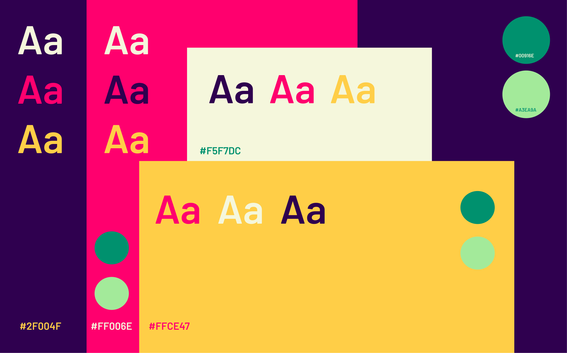
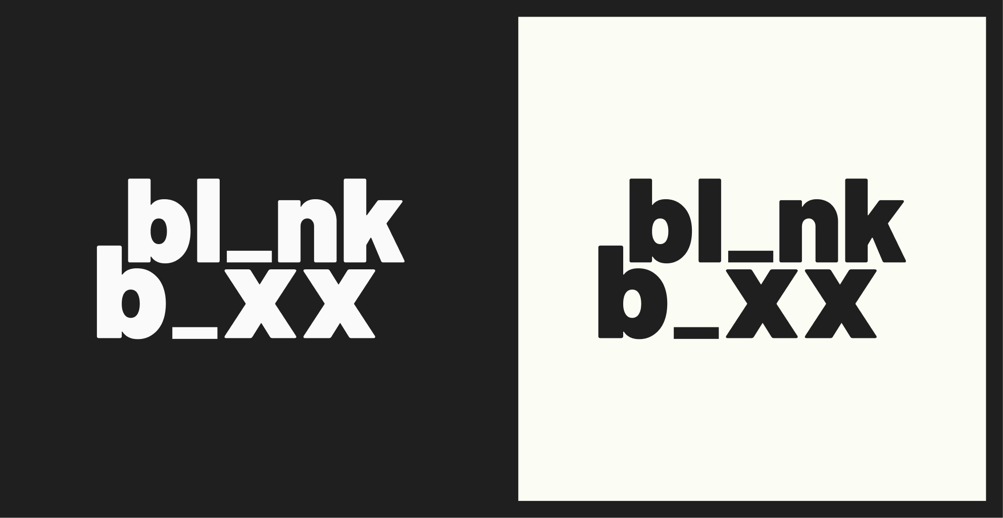
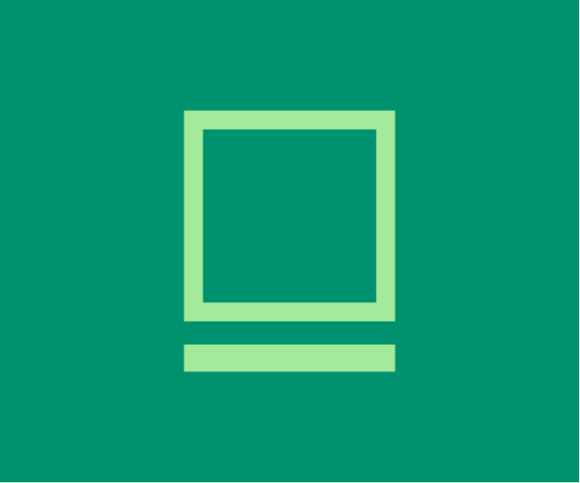
Identity system
A concise kit of parts: marks, wordmark and colour logic stripped back so the brand can move across digital and print without losing itself.
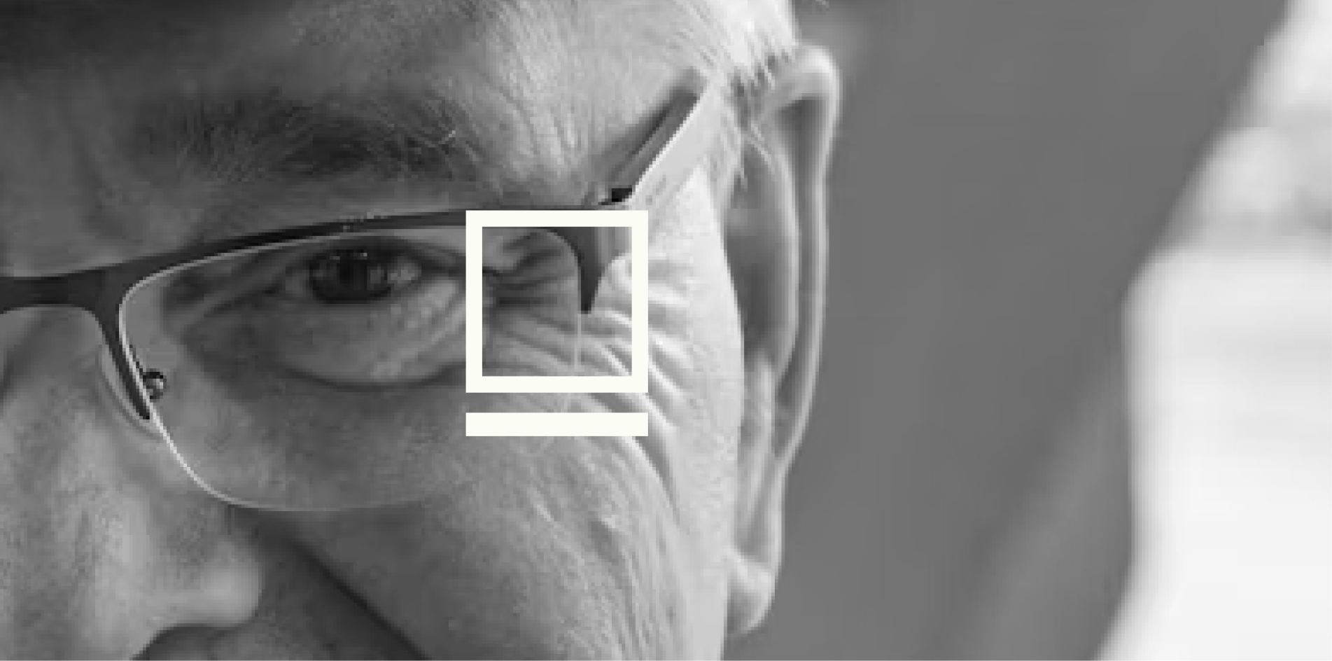
Territory & applications
The brand needed to feel rooted in place, then prove it could travel into real-world surfaces without turning ornamental.
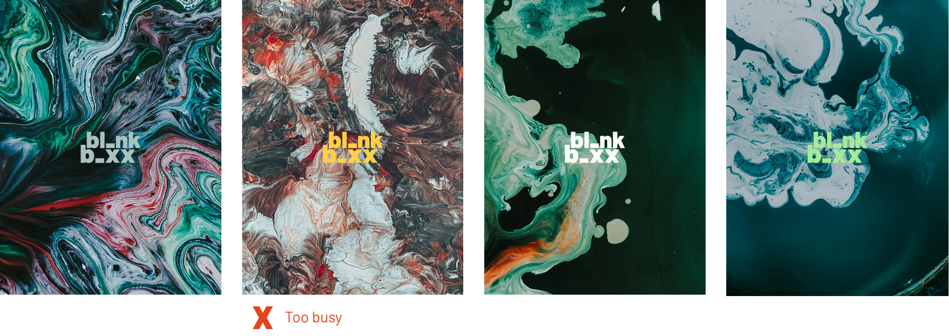
Also in the territory
Next project
House 7
Brand · Identity · Web